![[personal profile]](https://www.dreamwidth.org/img/silk/identity/user.png) luminousdaze
luminousdaze asked me how I go about color challenges. I love color challenges and participate in a lot of them, so here goes!
First off, I always try to fit every color into every icon. ...This does not make my icons the best-looking in the hall of fame posts, just sayin. :D People who go for exactly one color, at most two, are the highlights of those. Example:
iconcolors hall of fame #85.
Looking through my icons for
![[community profile]](https://www.dreamwidth.org/img/silk/identity/community.png) iconcolors
iconcolors, I ended up with two main techniques I use that I am going to describe here:
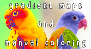
1) Gradient Maps
I already wrote a tutorial on that
here. But I think it's worth going into detail about how to decide whether a palette works for a gradient map or not. Because most of them don't really.
gradient map examples
Palettes that I have used Gradient Maps for recently:
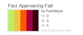
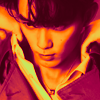

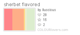
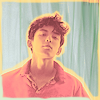

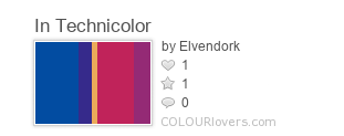
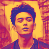

All these have one characteristic in common: you can order the colors from dark to bright and the resulting gradient will look nice. Mostly what this boils down to is that the skin color (of all but the very darkest black blorbos) will be something like beige/orange. This way, you can simply color the whole icon with that gradient and be done.
This is of course not always the case, but it's enough if two or three colors form a nice gradient - especially one where the face color is going to come out a) nice and b) close to the palette colors. In those cases, I use only some of the colors for the gradient, and then cut out the background and fill it with the remaining color(s). Like here:
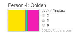
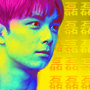

I guess whether yellow-green-turquoise is a nice face color is subjective ;), but all three are palette colors, so I ran with it. The pink here looks like it's part of the gradient, but it's not really. There were no white parts in the image, so the pink never turned up. (Same with the red.) I simply colored his hair pink and the background yellow afterwards. I don't know why I put dark blue there because it's not part of the palette, but I suspect it just looked nice? There are no dark colors in the palette at all, and you always need a bit of contrast.
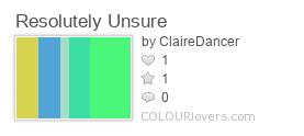
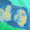

Here, the green palette colors aren't part of the gradient. The gradient just covers three colors, where actually the grey is a natural mix of the ochre and blue, so the grey appeared on its own. I thought the combination also looked nice on faces, so I went with it. The remaining green colors I used to manually color the background and his shoulder instead. Note that here, too, I added a darker blue to the gradient, so the icon retains some contrast, even though there is no such dark color in the palette.
Conversely: palettes I would not use for gradient map coloring:
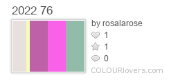
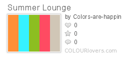
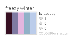
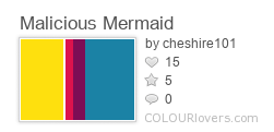
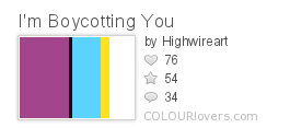
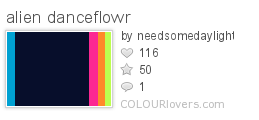
The reason is relatively simple: none of these colors make for good face coloring. They're either too close together, like orange/red or the purples in these examples, or too far apart, like yellow/purple or yellow/blue. (Or just a color I didn't feel I liked at the time.) I want the end result to have the palette colors in them, not some grey-brown mishmash which you get if you make a yellow-purple gradient, and I usually also don't want the faces to be green or blue (although there are exceptions, see above :)).
For palettes like these, I will use my other coloring technique(s):
2) Manual Coloring
The main difficulty here is to hit the exact color from the palette. I can't claim I always manage. :) The things I look out for are hue and luminosity. As long as those two match relatively well, I'm happy. Saturation is also a factor, but not the first one I look at. So usually my process is like this, for every single color separately:
- find a part of the base that has at least similar luminosity already to the palette color I want to use
- color it
- if it's too dark, try to lighten it up (overlay with a light color, color dodge, linear dodge)
- if it's too light, try to darken it (overlay with a dark color, multiply, darken, color burn, linear burn)
- if it's too pastel or too vibrant, try to adjust the saturation
A lot of palettes will have matching saturation throughout, that's just what makes a palette look good/coherent, so usually this is not a problem.
I definitely didn't manage to pick examples for every single technique I listed here, but there is a lot of linear dodge and overlay at least. I mostly experiment with that, anyway, until I hit on a blending mode that fits. It depends a lot on the original cap and on the colors of the palette, so I guess there's no way around doing that by trial and error again every time.
On to the examples!
example 1
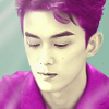
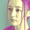
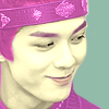
I loved this palette a lot, and I ended up coloring all three icons the exact same way, with yellow faces and purple clothes and green background. (I usually try to use at least two different ways to distribute the colors for each three-icon set at iconcolors, but... sometimes the palette just wants what it wants. :D) I sadly only managed to put the light grey into one of the icons. Here's a step by step tutorial on the second icon, which hopefully shows how I get the colors to match the palette in hue and luminosity:
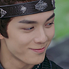
I cropped and sharpened the cap, this is the base:
I added a color layer with the dark purple from the palette and manually painted the mask so the purple will color his hat and robe, and set it to Lighten 50%:

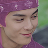
You can tell that the purple on his hat is still too dark (I put the palette purple next to it for comparison).
To bring it closer to the right color, you need to use a blending mode that makes everything brighter without losing the hue. Depending on the color and brightness of the cap, my go-to blending mode is Color Dodge. But sometimes Overlay works too, Lighten is good for pastels, or sometimes even Linear Dodge (Add) on very low opacity.
So I duplicated that layer and set it to Color Dodge 50%:
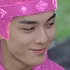

Oops, now it's the brighter purple (added here for comparison). That was not on purpose :D, but I need that color, too, so I continued.
Next area: the background. I added a color layer with the green from the palette and set it to Normal 100%.


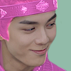
Of course that exactly matches the palette, since the blending mode is Normal 100%. Moving on.
Next area: his face. I first tried to make it grey, creating another color layer, masking it to his face, and setting it to Color 100%:
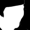

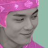
If I'd liked the face grey, I would then have proceeded like with the purple and added another copy with some blending mode that makes it lighter. But I didn't like it, so I tried the exact same thing with the palette yellow instead, setting that to Color Dodge 50%:

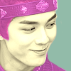
Funnily, this only works when both the grey and the yellow layers are active. The yellow layer on its own looks like this:
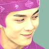
Much too orange for the palette color (added for comparison).
Alternative ideas: duplicating the yellow layer and setting it to Hue 100% or to Color 100%:
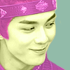
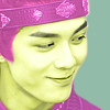
They all looked too vibrant or too green for the yellow palette color (added in the middle for comparison).
So the combination of first desaturating it and then making it yellow came the closest to the palette. In this case, it was purely accidental, because the palette contained a grey color. But this is a neat trick that you might want to keep in mind. In this case it worked better than any of the alternatives.
Last step: I colored his eyebrows and lips with the purple from the palette, i.e. I manually painted over them with a small brush and set the eyebrows to Lighten 30% and the lips to Multiply 30%. Done.
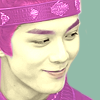
Now, as I mentioned, the light grey is still missing in the final icon. I would usually then have used it as a light flare (like in the first example for this palette above), but I really liked the flat look of the icon, so I left it out altogether (and made a second one exactly like it). Well, 4 out of 5, I'm calling it a win. :D

example 2

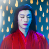
All three of these are completely manually colored. I'll show the first one because it was the easiest, and because she is a ghost, so the white worked best with her skin color.
As usual, I cropped and sharpened the cap to get this base:
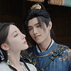
Next, I painted over their faces with the white from the palette with a soft brush (the black here is just for visualization, it's really transparent). To match the luminosity, i.e. make it light enough, close enough to the white, I set it to Color Dodge 20% - too much would have erased their facial features. Then I copied the layer and set it to Color (I left it at 20%, I can't tell you why) to get closer to the saturation/hue.


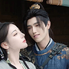
It's really not all that close, but I considered it good enough. Next, I decided that the existing luminosity of his robe was closest to the blue in the palette, so I colored his robe blue, again simply painting into a new layer with a soft brush. I set this layer to Color 100%. The luminosity really was already perfect, so I made no adjustments there at all.

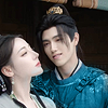
Good. Next, yellow. Her robe is very light, so I chose it for the yellow color. I painted some of the palette yellow into the layer and set it to Color 100%. Again, the luminosity was already very good, so nothing else to do here. Then I decided that his robe could use a few golden highlights and painted over the lightest parts of his robe as well.

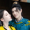
That was again very easy, no need to change the luminosity at all. The next step is the purple for the background: I painted it with the palette color and a very small hard brush, to get their contours. I left that at Normal 100%.


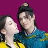
Now the only color missing is the red, and it fits well with the purple, so I added a texture by azuremonkey to try and get some red in there. I rotated the texture and then recolored it to orange (because purple+orange->red). I clipped that to the purple background layer and set it to Linear Dodge (Add) 30%:
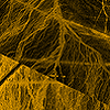

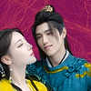
That didn't look quite red enough to me yet, so I added another layer with the red color, set it to Saturation 100%, and then toned down the texture to Linear Dodge (Add) 10%, which gave me this:

Almost the same, but I liked it better. (Now that I'm looking at them again, I feel like the darker purple suffered from this step, it looked closer to the palette color before. Oops.) Okay, last step: I thought it could need some lighting. I will usually choose the lightest color in the palette to add a light spot, but this time, I thought there was already enough white and not enough yellow, so I picked yellow. I painted one corner with a very soft brush and set it to Normal 100%:
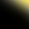
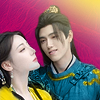
Not bad, and it nicely balances the yellow in the other corner, but... I thought it drew the eye too much, and the red color was still underrepresented in the icon, so I ended up setting it to Overlay 100% instead:

This, kind of accidentally, turned the lighting red, and I thought it looked much better this way. That was it!
I'm not sure this tutorial really managed to show the parts where I fix luminosity after the fact (except maybe for the faces, but they're really not white at all in the end either). A lot can be accomplished by choosing the right cap - just note that it doesn't have to be the color as much as the luminosity that has to match!
Just to be able to show one more approach, I added another example where I didn't already choose a fitting cap below.
example 3
For the same palette as above.
All right, now this cap barely has anything in common with the palette. *cracks knuckles*

The first thing I did was increase the saturation (and try to match the background to a palette color). So I used a Hue/Saturation layer and moved the Hue slider to the left (-39) from orange to red and the Saturation slider to the right (+41) to match the palette's high saturation. As I mentioned before, most palettes are similar in saturation for all their colors, so this will probably help with the rest of the colors, too.
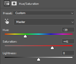

Now his face looks fugly, but the background is how I wanted it. So far so good. Next: add purple. There are black parts in the background, and if I want to make them another color, I can just use a Lighten blending mode. Which is exactly what I did: I painted to the left and right of him with the purple color and set it to Lighten 73%:


Two down, three to go. The next thing I did was lighten up his jacket so it has some texture and doesn't just turn uniformly blue when I color it. I used the same technique I use for hair that I explained in my last tutorial two weeks ago. So I duplicated the base and squished the levels until the jacket had the kind of definition I wanted. (There are sparkly diamond-things on his jacket. \o/)
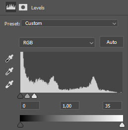
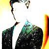
Then I masked away everything but the jacket, and ended up with this:
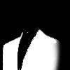

Okay, luminosity (and saturation) seem to fit, now: blue. I filled a whole layer with the blue from the palette and set it to Color 100%. You can also use Color Fill layers for this, I just never got used to those. I clipped it to the jacket layer, and now it looks like this:

I thought it was still too black and not blue enough, so I added another blue layer. That layer is also clipped to the jacket, it has its own mask, and I set it to Hard Light 82%. I am pretty sure it started out the same blue, but the Hard Light blending mode turned it more reddish/purple, so I adjusted the color to something a little more turquoise (#1b9fa5). For the mask, I just painted with a small black brush all the lines of the jacket i wanted to still have some contrast, and then I blurred it a little with the Smudge brush. It just lightens up the jacket a little bit:

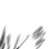

Together with the blue from the previous step, it looks like this:

It didn't end up all like the palette blue, some of it darker, some of it lighter, but the overall impression is that the palette blue is hidden in the average there somewhere. I thought this was good enough. Next up is yellow. I used this opportunity to fix his face color. I (very messily) painted over his face with the yellow from the palette and then set it to Soft Light 57%. Now it looks more like his normal face again, just more saturated than before, but that fits the rest of the icon, so that's fine. His shirt could have stayed white, I guess, but I found the yellow in the palette more important than the white, so I painted over his shirt, too, and set the layer to Darken 63%. That makes it a bit more greenish-grey than yellow, but I didn't want it to pop out too much, so I left it like that.
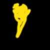
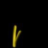

Now we're almost done. All I did from here is smooth the edges of his jacket a bit and remove the yellow color from his eyes, and it's done! I did not use the white from the palette in this icon at all! (I will spare you the vampiric-looking experiments). Again, 4 out of 5, I'll take it.
I hope you like this tutorial! If you have any questions, let me know!