Kathryn A. (![[personal profile]](https://www.dreamwidth.org/img/silk/identity/user.png) kerravonsen) wrote2022-11-22 06:54 pm
kerravonsen) wrote2022-11-22 06:54 pm
Entry tags:
Almost-finished Planet Art
So, I'd like some opinions, please. Currently working on some planets art, because I felt like doing a planetscape. But I have three versions of it, and I'm not sure which one is the best. So any of y'all, take a look and give an opinion!
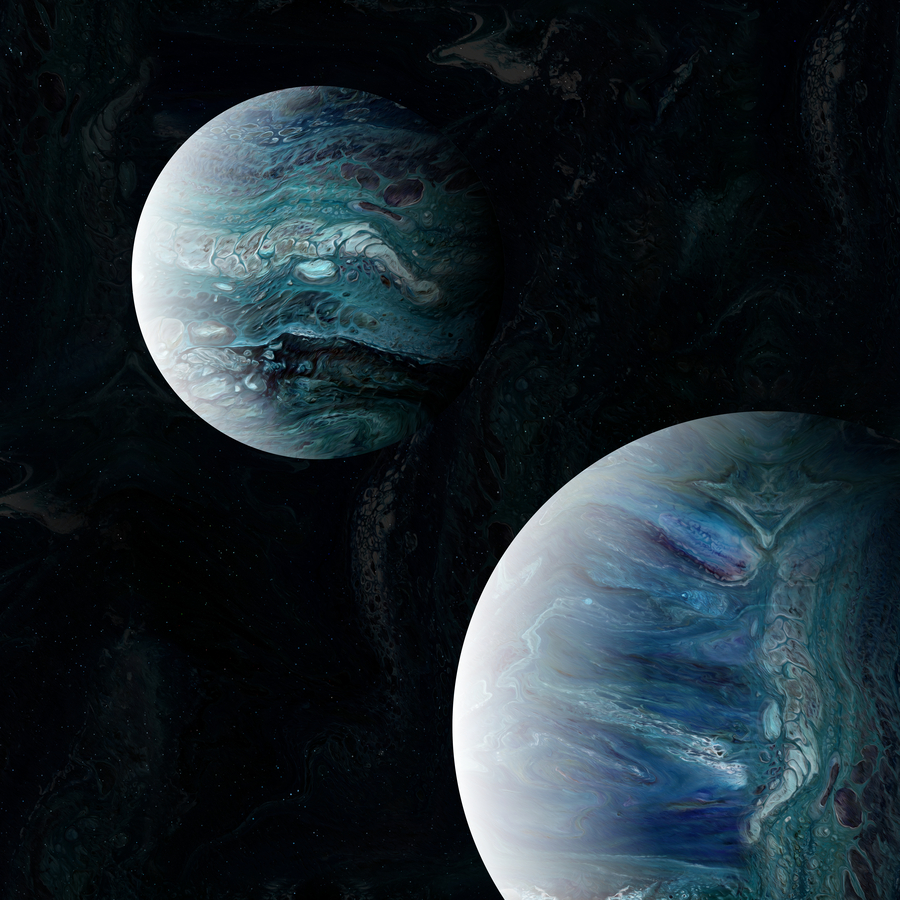
Version 2:

Version 3:
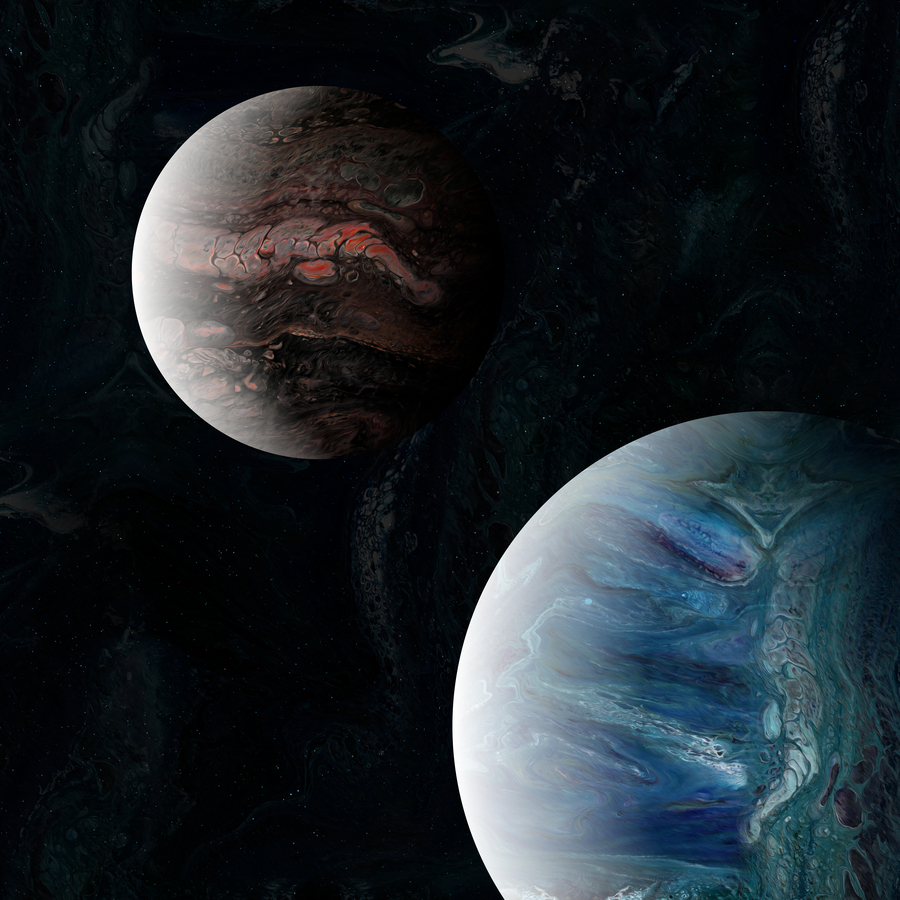
Which of the three do you prefer?
no subject
no subject
Yeah, I wanted to try out making the planets different colours. Also because most of my recent planets have been blue/green I wanted something a bit different.
I don't understand what you mean about the lighting in the pink one not matching the blue -- the lighting is exactly the same in all three. Though maybe because the pink one is such a pale colour it isn't as visible as the other two?
no subject
no subject
no subject
Ha! That's basically the reverse of Vilakins' preferences.
no subject
#2 is the prettiest.
#3 looks like #2 after some terrible disaster has burned the surface. (Possibly if I hadn't seen it next to #2 it wouldn't feel so gloomy?)
no subject
no subject
strongly prefer two. the first one is uncanny valley for me with the matching colours; the third one the lighting feels off.
no subject
no subject
Signs that they are all good, because they all get some love!
no subject
no subject
Yes, #3 is very dramatic.
no subject